Our user are a business end users, which means that they are not very technical.
They use the app mostly as it’s easier to consume data on mobile than on SaaS, doing tasks such as viewing and analyzing reports, creating screenshots, sharing data with colleagues, or commenting.
Opportunity
As part of iOS 13 introduction, Dark mode became the standard for many first party applications, we saw the opportunity to improve the experience for our users by allowing them to switch between the different modes, and to be the first BI application to have this feature. As a Product designer I saw an opportunity to leverage the Dark mode feature in a way that can create a better workflow for our design system both for engineers and users, following by aligning old components, colors and experiences, and create an ever higher accessibility standards.
Goals
1| Supporting Dark mode OS part of the iOS 13 Compliance
2| Refining our Design system by aligning colors & elements
3| Remove unnecessary cognitive friction using color conventions
4| Supporting accessibility
2| Refining our Design system by aligning colors & elements
3| Remove unnecessary cognitive friction using color conventions
4| Supporting accessibility
Motivation
1| Being Apple’s first-party application & the first BI app adapting the Dark mode
2| Increasing our visibility in the market
3| Create rich experience, working not only on performance but also on new features
2| Increasing our visibility in the market
3| Create rich experience, working not only on performance but also on new features

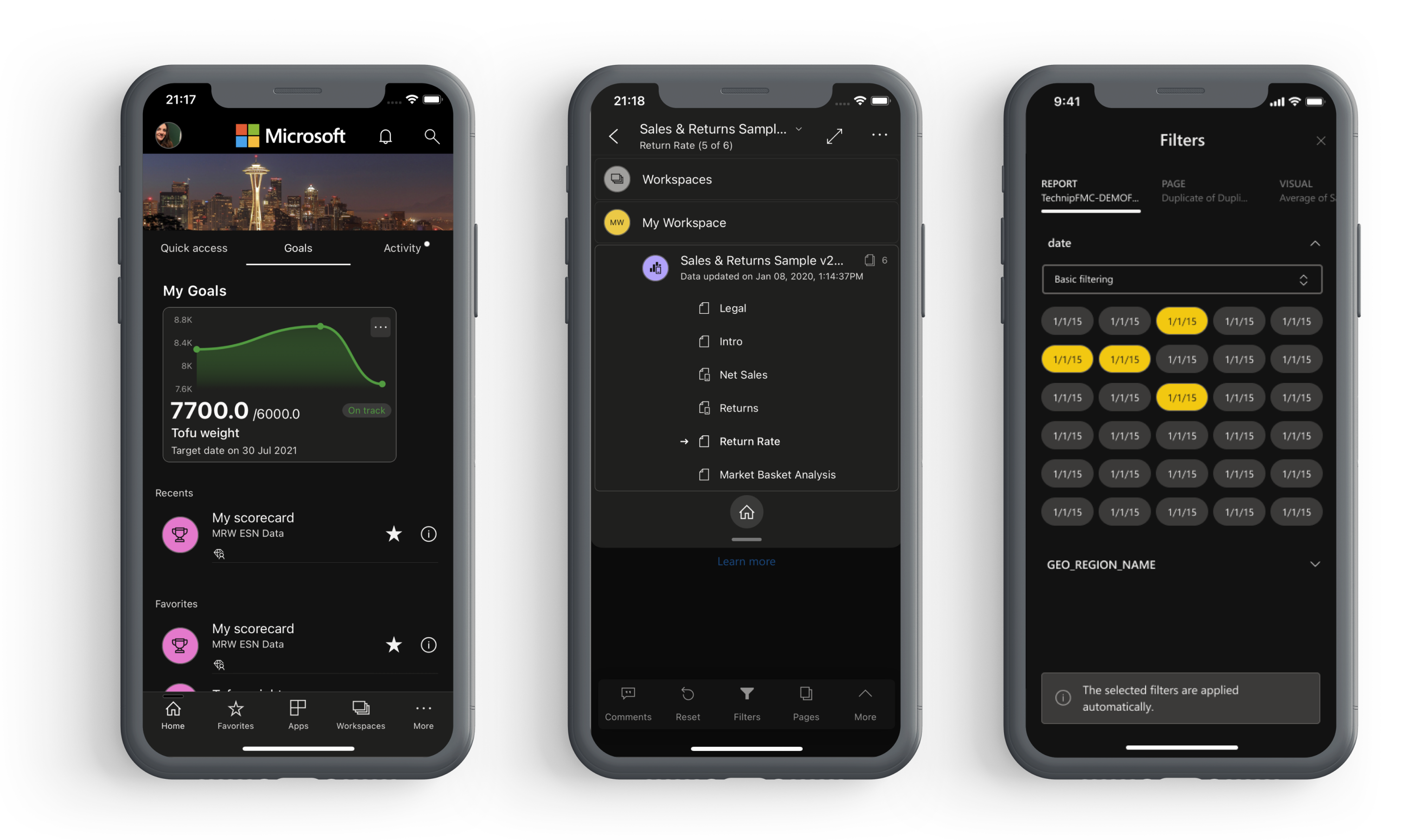
First things first: Digging trough legacy
In order to start the work on new dark colors, I had to understand what what colors we use today, and yes, we have a design system, but as most of the product, we also have hidden hard coded colors from previous design legacies.
Those had to be deprecated and aligned to our current design system, in order to do so, I created an audit of all the screens we have today all over the app (both iPhone & iPad, since some of the experiences are different).
Here's an example of a the color coding prior the alignment:
Those had to be deprecated and aligned to our current design system, in order to do so, I created an audit of all the screens we have today all over the app (both iPhone & iPad, since some of the experiences are different).
Here's an example of a the color coding prior the alignment:
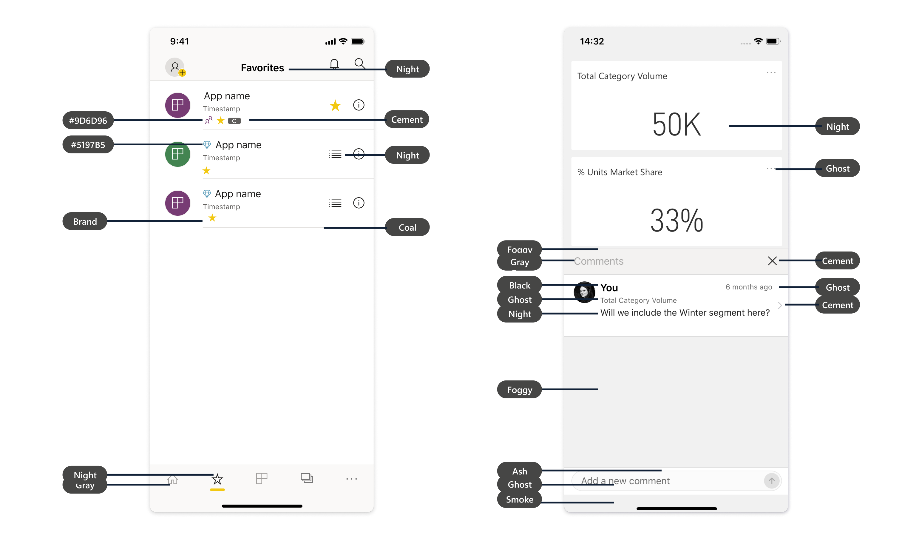
System and environment constrains
Our screens super smart, and people are unique. No one use the same amount of brightness (some use full brightness and some barely adjust it), have the same sight or located in the same place. Which make the color we actually see - dynamic.
Our phones behave different in different environments and depend on the time of the day. During the day or sunlight, our screens more white and blue, while during night screens more warm and yellow. Which means is that your color might look differently in each of those scenarios, and it'll require for you to check that it is still accessible and been seen.
Our phones behave different in different environments and depend on the time of the day. During the day or sunlight, our screens more white and blue, while during night screens more warm and yellow. Which means is that your color might look differently in each of those scenarios, and it'll require for you to check that it is still accessible and been seen.

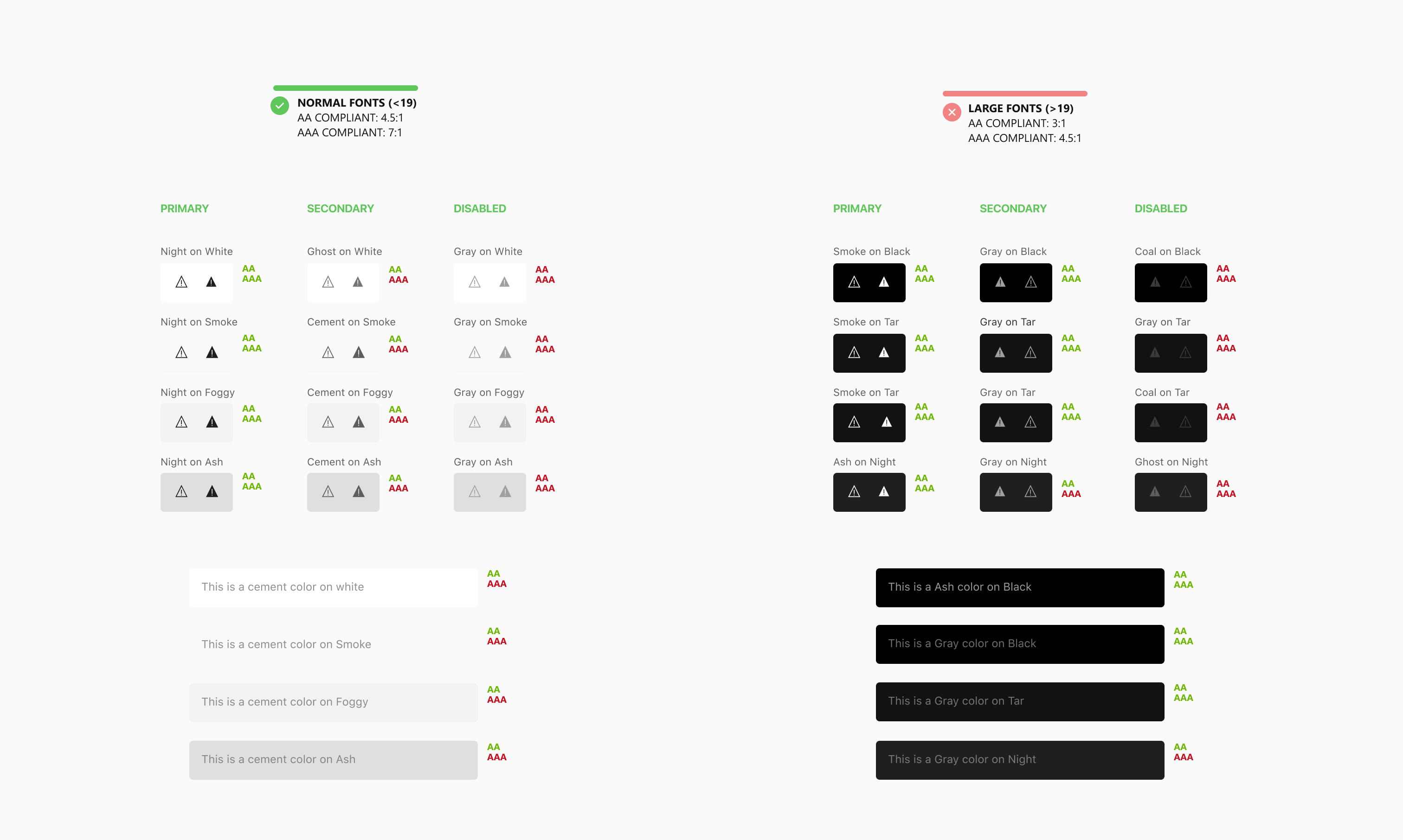
Accessibility constrains
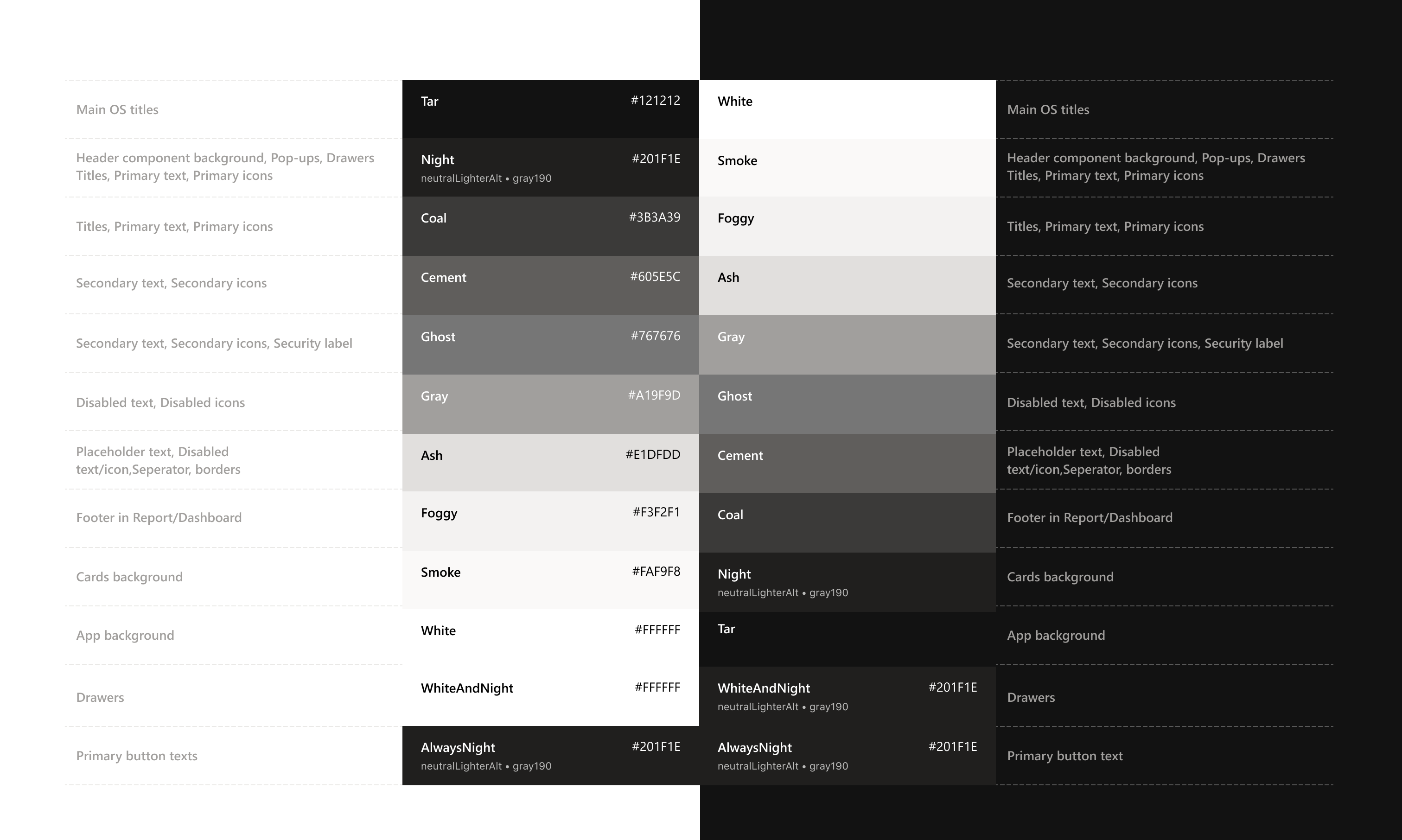
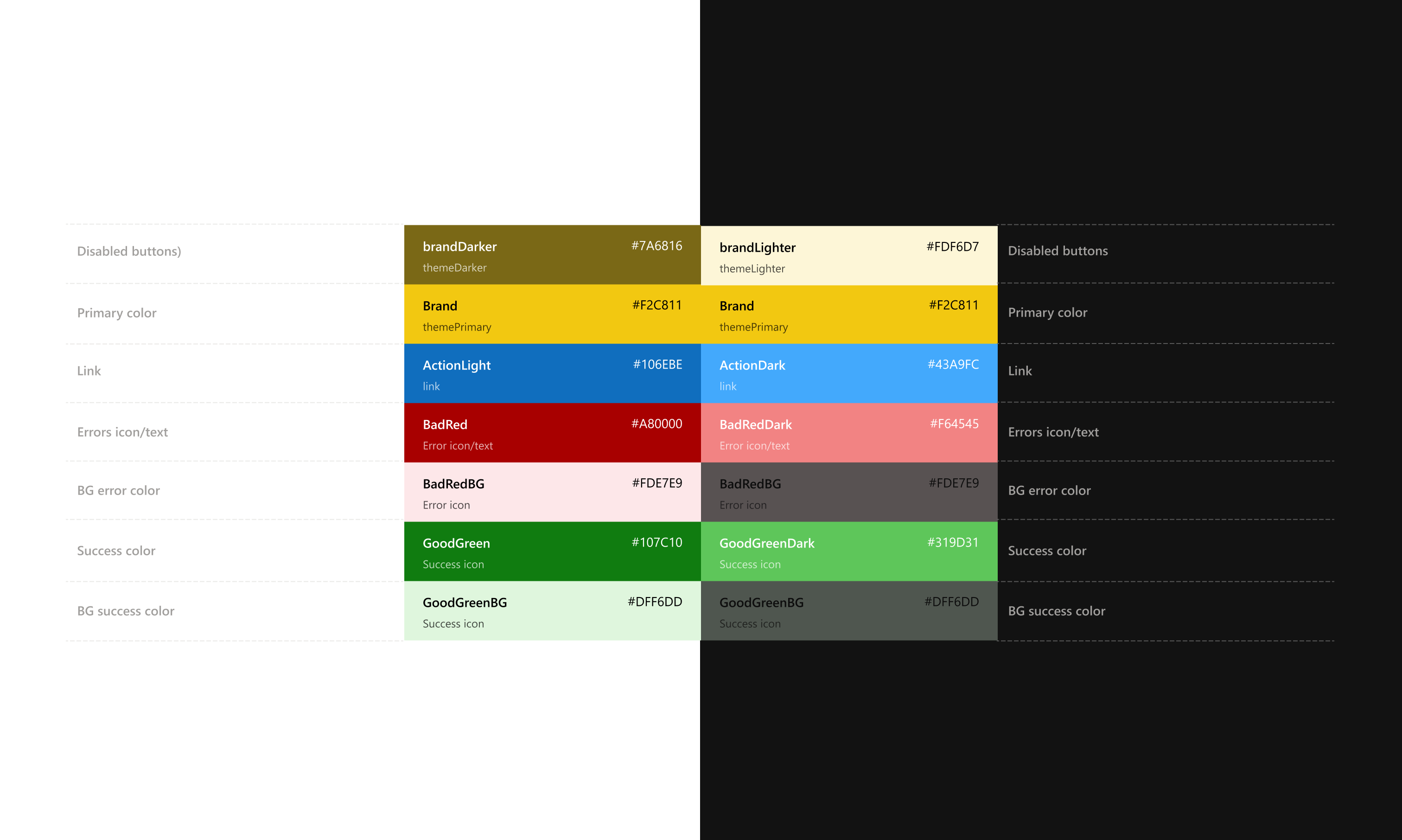
The audit of the app screens, gave me a better perspective of the color usage today, which helped me to work with those colors and find his appropriate ‘twin’ in dark mode.
Since we use 3 different background colors (for example the main app screen get color X, the card background on this main screen get color Y, while header and footer backgrounds of the app get background Z). I had to make sure that all of the text/icons/action link colors pass the WCAG accessibility bar, both on light and dark mode themes.
I created a guidance to which color one should use when working with Primary/Secondary/Disable color cases.
Color usage
The vast work I did on the accessibility helped me to create the logic for color usage and behavior for both modes, to decide which components will receive X color, which will receive Y background, and the most important is how those work holistically together when switching between modes, while keeping in mind that each user prefer different brightness, which may give the colors a slightly different ‘shade’ to the eye.
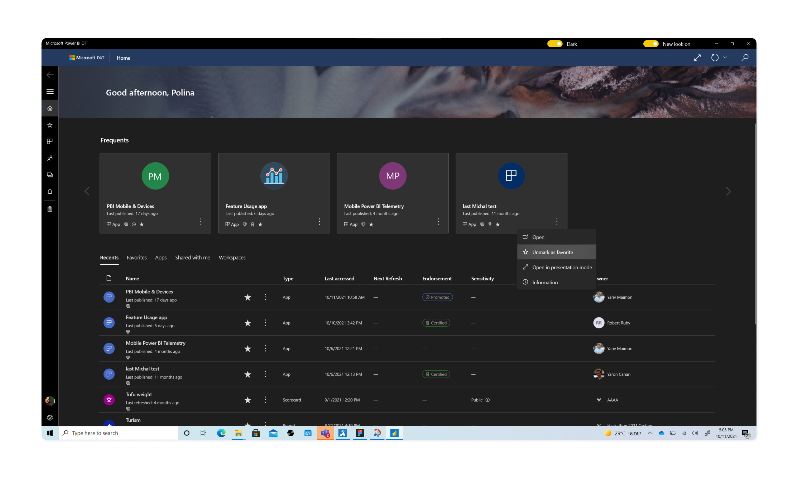
Development
I worked together with developers using a hand-off of the new changes, creating bugs to adjust our Design system and deprecate hard-coded colors, and to create the best possible experience for both feature users - whether you'r a light or a dark mode person (I prefer Dark mode btw on most of my apps).
Adaption
First - we were iOS 13 compliant, and the first BI app adapting Dark mode on Mobile.
We saw a 34% usage adaption of the iOS dark mode within a few months, as well as we improved user satisfaction.
It was a great success and the team decided to work on Dark mode as well for Android and Windows app in the following months, since we already had a Color system, all I had to do is to audit the current screen in both platforms and assign tasks.