Our user are a business end users, which means that they are not very technical. They use the app mostly as it’s easier to consume data on mobile than on SaaS, doing tasks such as viewing and analyzing reports, creating screenshots, sharing data with colleagues, or commenting.
Motivation for a change
Our users are end users, they're on-the-go most of the time, and while they need to quickly see and understand data, they might get lost in the amount of items (reports, dashboards, apps) they have. We want to give the user the most intuitive experience (in this complicated area) to navigate between the different items, to have an easy entry point to 'Home', and to surface the most important information about the item (labels, timeframes, indications.)
Challanges
Information architecture for different artifacts
Our users have thousand of different items (Reports, Dashboards, Apps, Workspaces, etc), moreover - each item have some information about it. It takes time to navigate to the desired report, and while each report or app can have a few pages, you'll need the ability to navigate between them, understand where it's located, when refreshed, when shared, or even what indications this report have (data classifications, links, etc).
Clear navigation
The navigation and information about the item is partly hidden within a few different components and if you want to go to the main page of the report you need to do X, if you want to see when it refreshed you go to Y, and if you interested to go to home or you go to Z. They might also want to learn where the report lives (Favorites? Shared with me? My workspace? Apps? etc)
Lots of information but little space to work
The main UX challenge was to create a complicated navigation system within the Mobile frame, which makes not much space to work
End goals
• Improve user's orientation of the items within the app
• Educate the user about item's location and information
• Respond to users feedback and research findings
• Align all platforms with regards to actions and iconic information
• Increasing usage of different items
• Educate the user about item's location and information
• Respond to users feedback and research findings
• Align all platforms with regards to actions and iconic information
• Increasing usage of different items
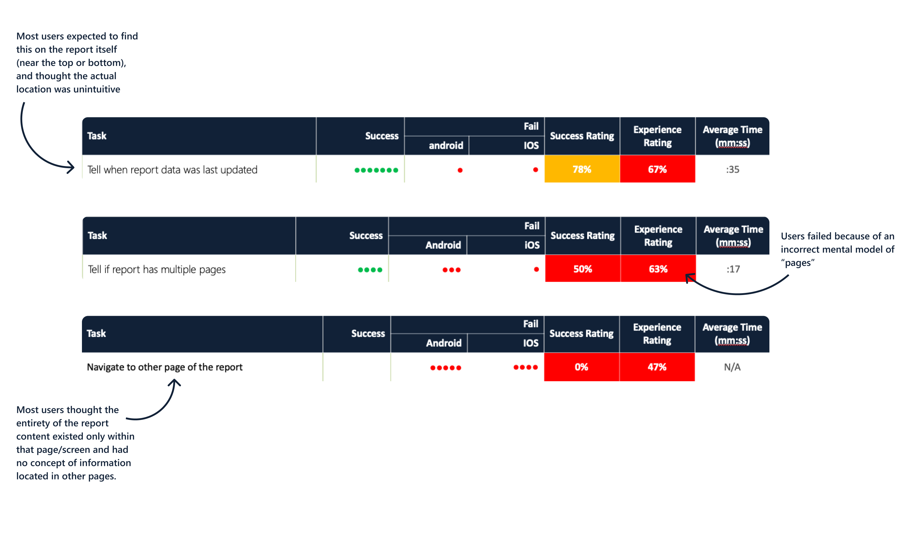
Qualitative research to identify pains
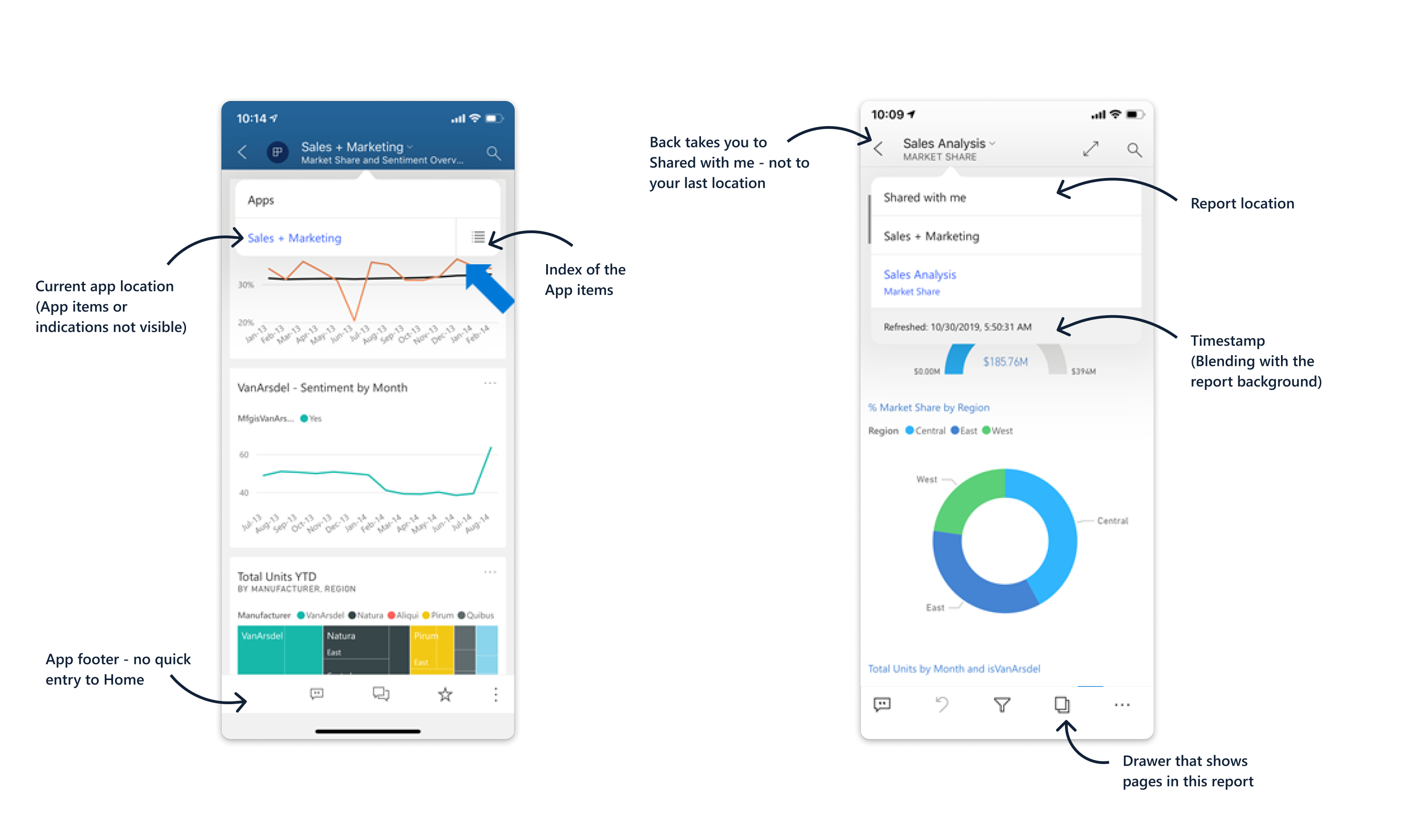
• Pages non visible, Users don’t understand how to navigate to other pages
• Pages icons looks lige the generic ‘copy’ icon, consider another icon (or perhaps a walk-trough?) How the user knows that there’s pages?
• No one discovered swiping
• When user searched for pages most of them clicked on the dropdown arrow on the title.
• Decide which location the user will see in the breadcrumbs - the locations he came from (for example Home- Recents) or the location of the artifact (Apps, Workspaces, Shared with me, etc)
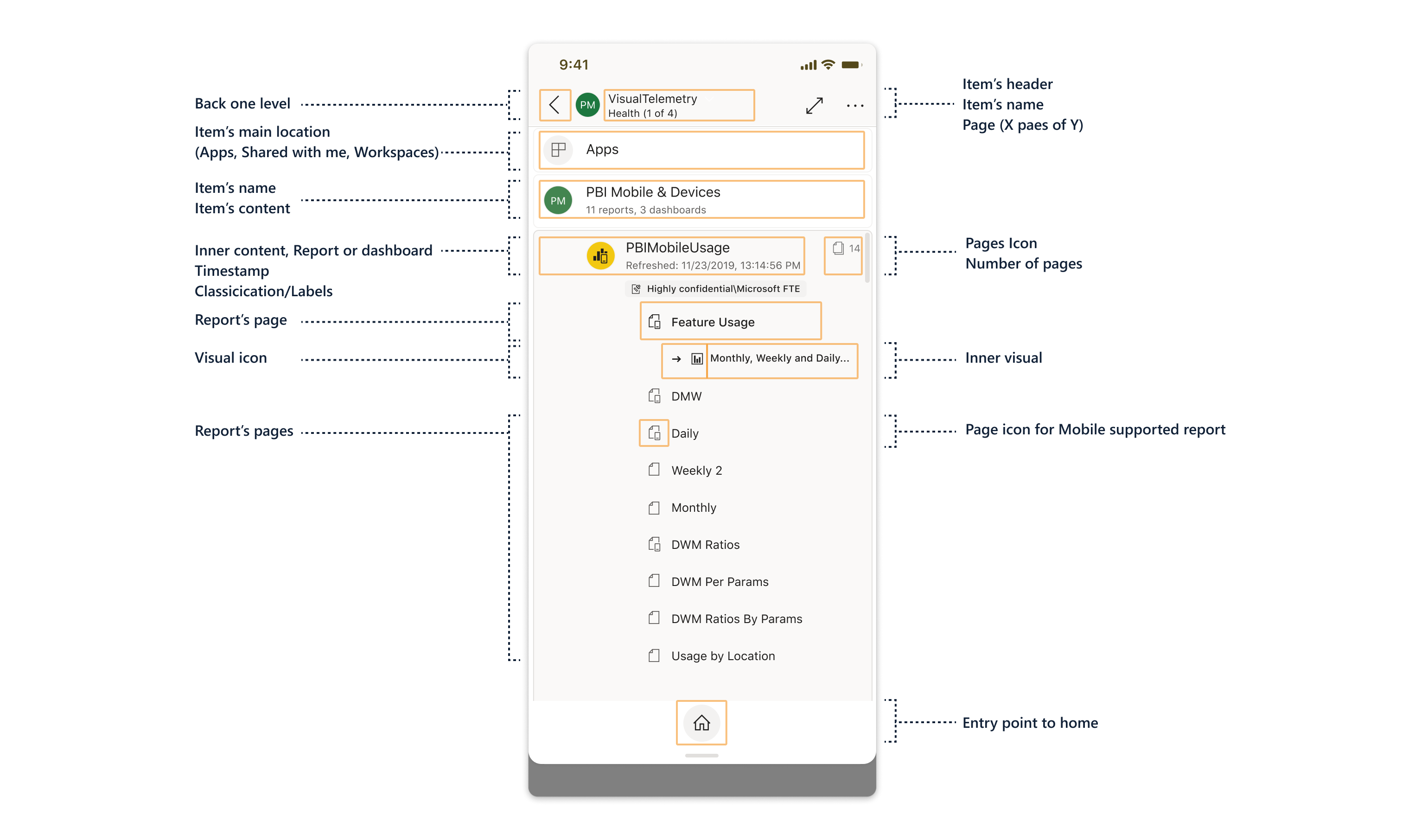
Defining the tree of items and locations
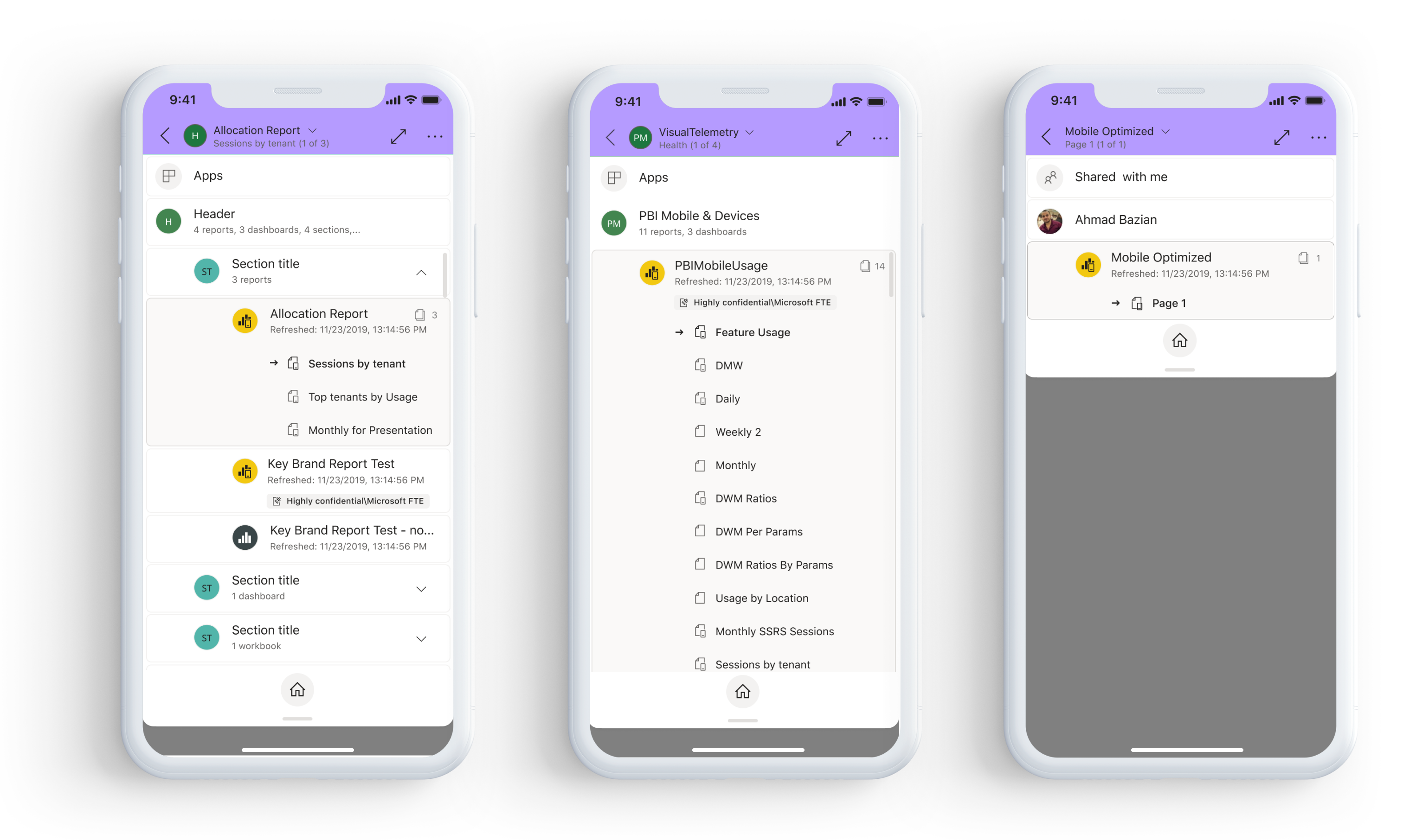
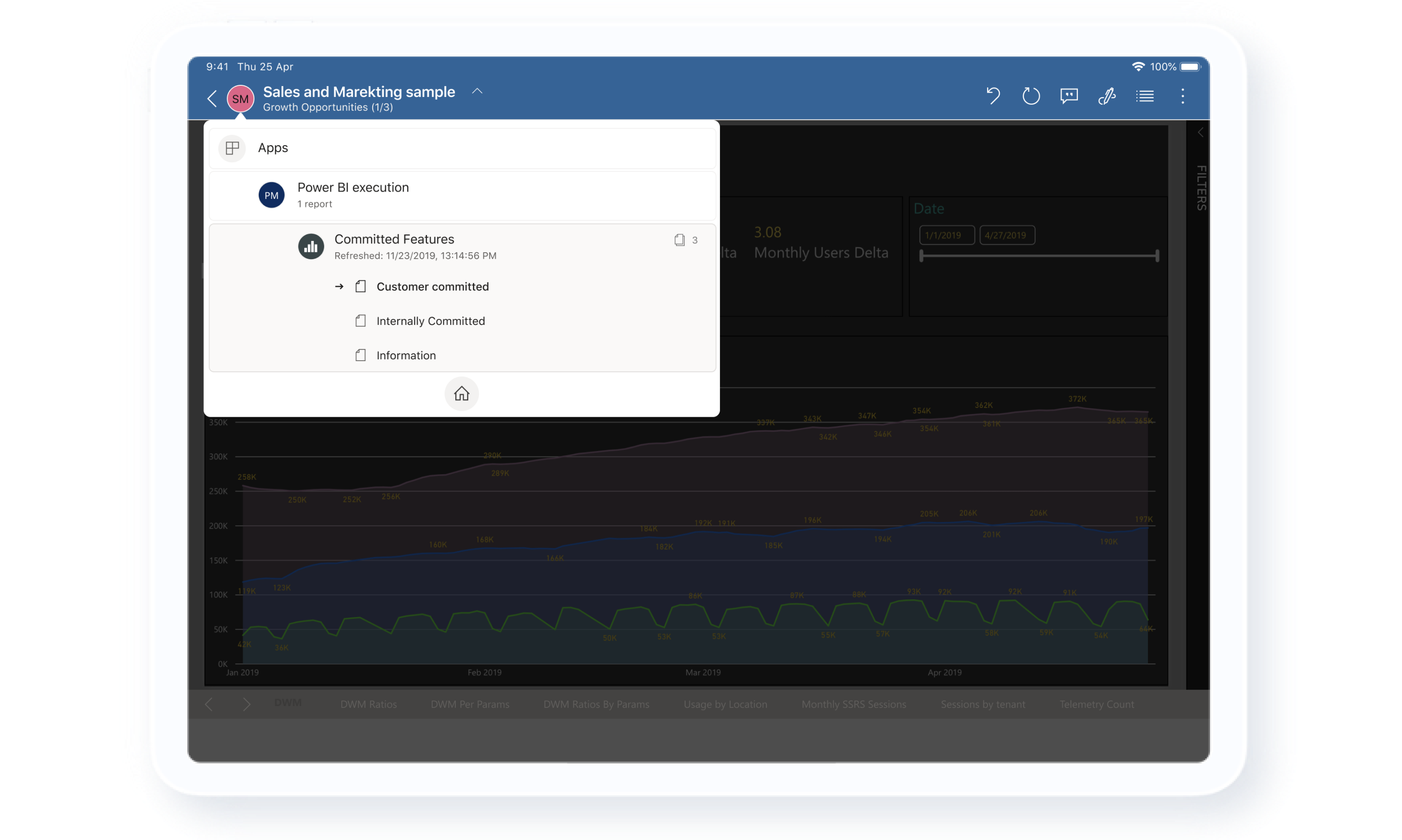
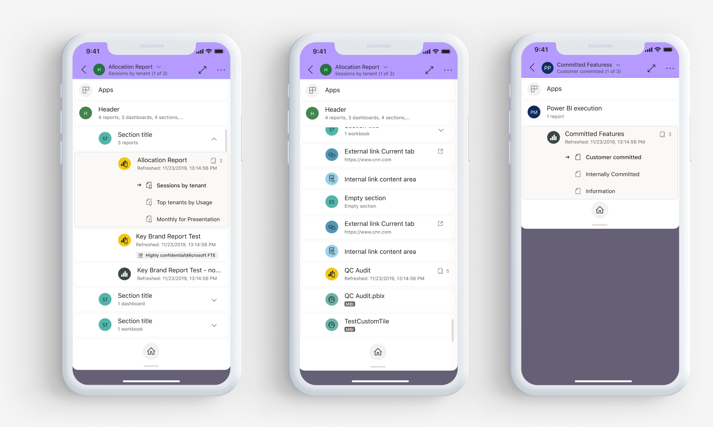
We started by creating a flow of the main item's locations, the different types of possible items in those locations, and it's properties. This helped us to create a map of the navigation tree (a term that made sense at the moment which followed during the release too).
We also defined icons for each of the locations and items, and reordered the indications and labels by the order of urgency for the user to see.
We also defined icons for each of the locations and items, and reordered the indications and labels by the order of urgency for the user to see.

Let me get there quicker
Another thing which was necessary is the ability for the user to navigate not only between the current Report/Page/App/Artifact, but also the ability to navigate quickly to home page, or the main page. Creating a quick entry point to the home page in the Navigation tree, made the navigating experience much simpler.
We also changed the Back (<) button to go down only one level, and not to go back to the Home page as it was today.
Imagine you're in the Home page > Favorites > Report > Page 1 > Visual 1, and you're clicking back and it takes you to the main page (Favorites) and not a level back. This behavior was weird since the user used to go back to the previous page and not skip 5 levels.
Hierarchy
The hierarchy was build by the importance of information the user need to see and the interactions he would like to make on the first level. The more complex the item is, the more data and inner components it has.
There's an indication to distinguish between different reports (Mobile support report and not), an important information to educate the user about the items (such as how many pages there are, which page the user located now, content of the App/report).
There's an indication to distinguish between different reports (Mobile support report and not), an important information to educate the user about the items (such as how many pages there are, which page the user located now, content of the App/report).
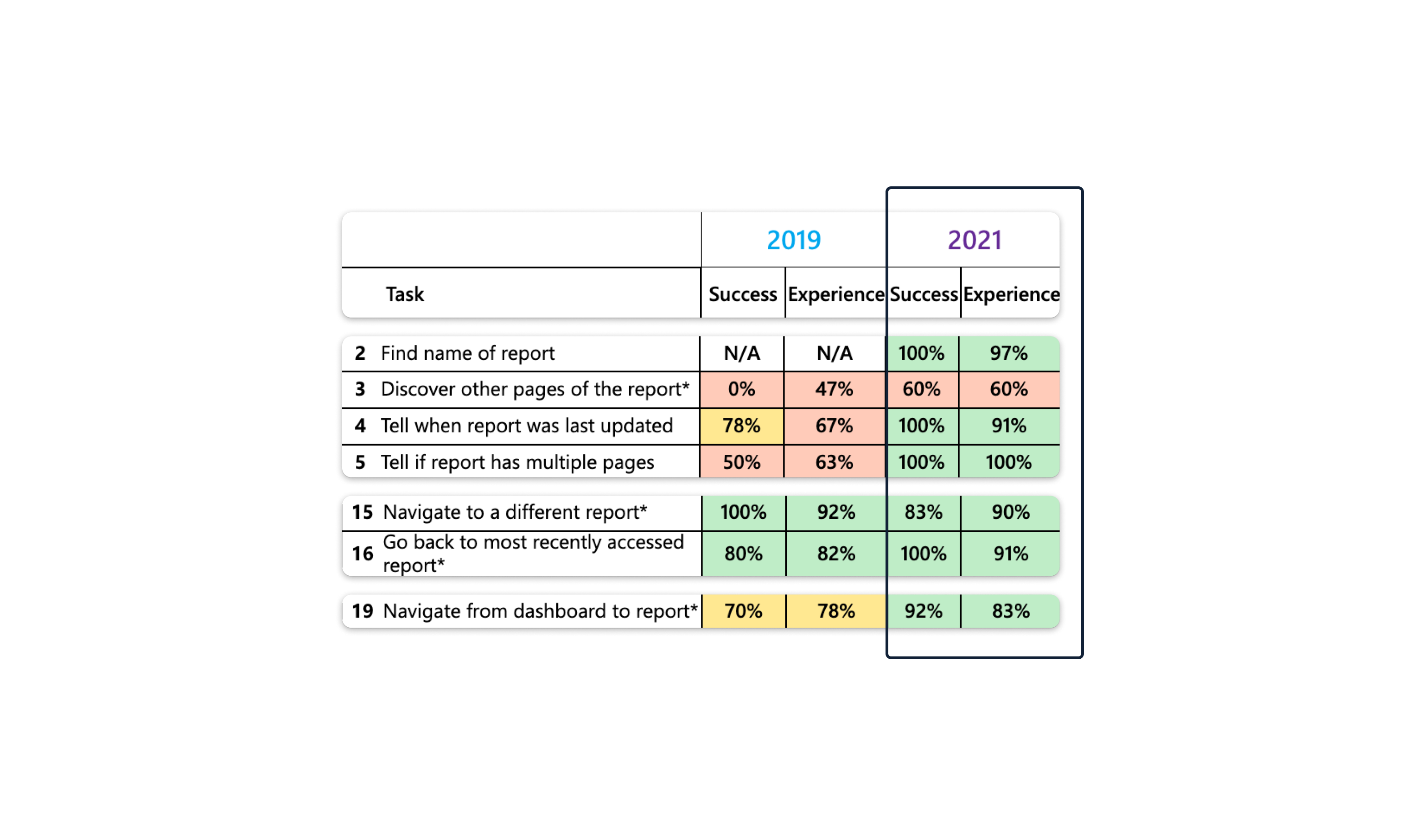
Post release research
After releasing the feature we saw a great usage of the feature on both platforms.
In our user research a few months later we could see a great improvement of the user experience and satisfaction, as well as success of the performing task of navigation and pagination.
In our user research a few months later we could see a great improvement of the user experience and satisfaction, as well as success of the performing task of navigation and pagination.
Navigation tree screens