Our user are a business end users, which means that they are not very technical. They use the app mostly as it’s easier to consume data on mobile than on SaaS, doing tasks such as viewing and analyzing reports, creating screenshots, sharing data with colleagues, or commenting.
Motivation
Make a one experience for all - both first run users and our already onboarded users. Create a simpler way to sign in for multiple accounts, educate through empty states and content discovery, and leverage shared-by-others data to improve collaboration and data consumption.
Problems & Pain points
We lose more than 40% of the users during the sign-in funnel experience - this is a huge amount. In our research we discovered that the drop-out happening during the different steps that required to sign-in.
Another thing is that when users sign-in - 25% of our FRE users land on empty home and see empty states - which make them feel miserable and prevent them from the many opportunities to learn about the app and explore it.
Problems & pain-points we encountered during a qualitative research are:
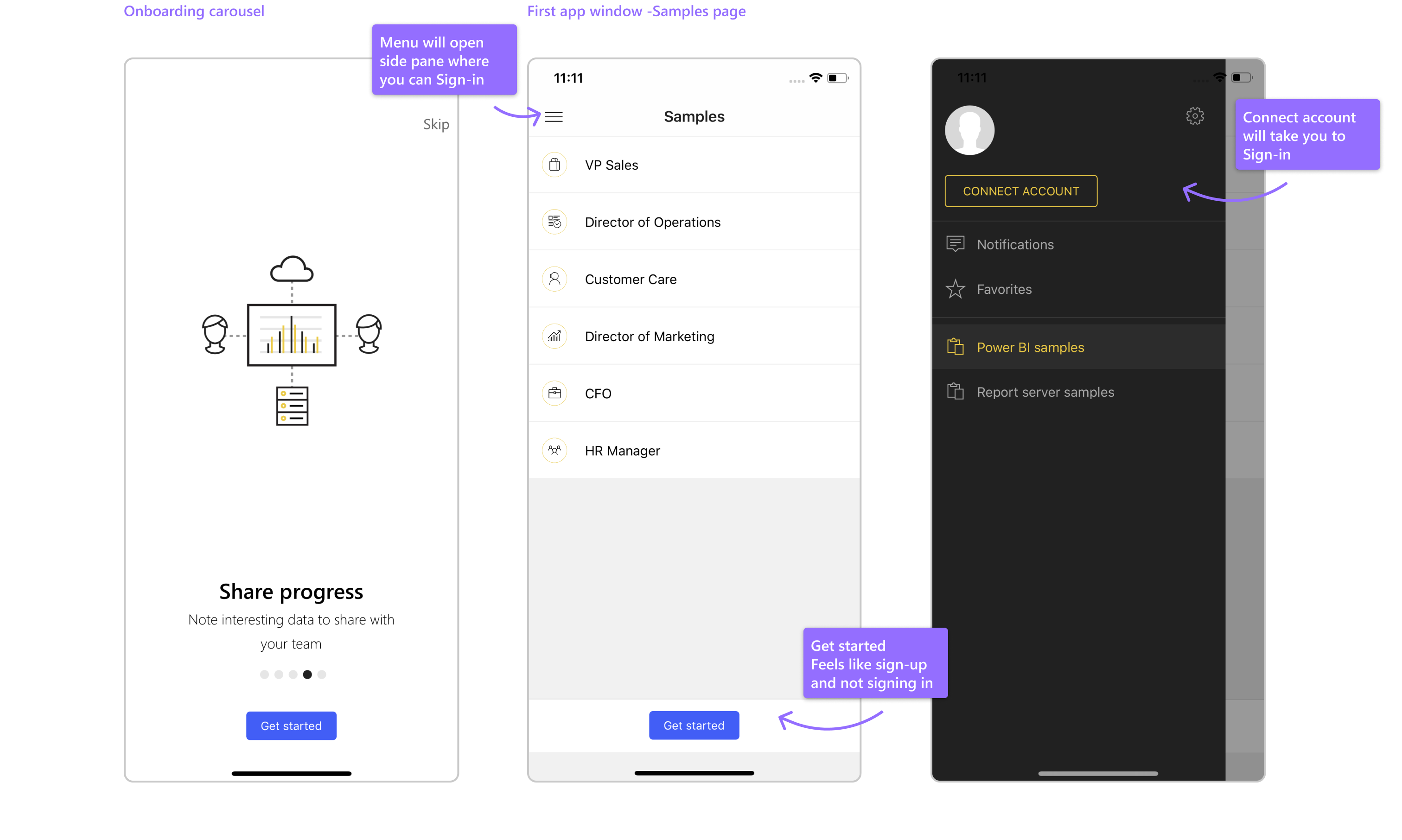
1| 'Get started' button feels like 'Sign up' - our users already signed up (organization account) so they don't click on it
2| Carousel content - very generic and non focused
3| The carousel comes first instead of signing in page
4| After the Carousel the user lands in a sample page - he need to lead it's way and find to the sign in button
5| Too many empty states and lack of app discovery
6| Difficult to navigate between accounts
Another thing is that when users sign-in - 25% of our FRE users land on empty home and see empty states - which make them feel miserable and prevent them from the many opportunities to learn about the app and explore it.
Problems & pain-points we encountered during a qualitative research are:
1| 'Get started' button feels like 'Sign up' - our users already signed up (organization account) so they don't click on it
2| Carousel content - very generic and non focused
3| The carousel comes first instead of signing in page
4| After the Carousel the user lands in a sample page - he need to lead it's way and find to the sign in button
5| Too many empty states and lack of app discovery
6| Difficult to navigate between accounts
Onboarding before the redesign

Goals
• Create an easy onboarding - don't let the user think
• Help Power BI users find content that is relevant to them
• Improve users retention - statistics show that those who view items during their first Power BI session are more likely to return to the app
• Increase customer loyalty and app visit
• Educate through empty states and shared data
• Reduce the dropping % of users
• Increase the MAU & retention
As part of the cross-platforms effort, we aligned the user flow, content and native components for both platforms - iOS & Android - to finally we have a similar experience on both platforms
Defining the new flow
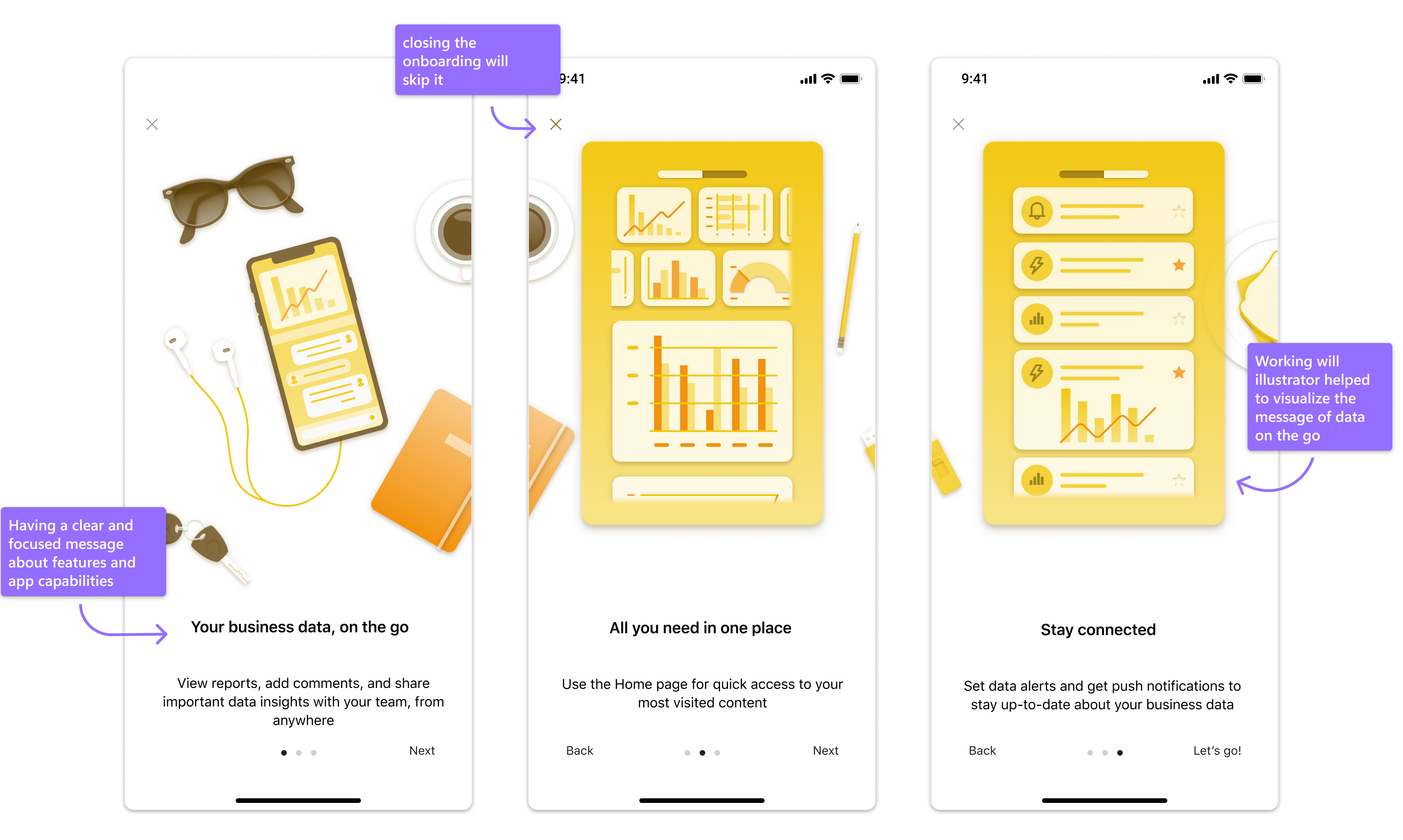
Users are not 'unfamiliar' with Power BI, most of them know what's the app for (they're coming from a SaaS app) and want to use the reports on the go. I saw an opportunity to leverage the feature in a way that can create a holistic experience for the user - to encourage him to sign in first - and if he choose otherwise - he'll have a 'Skip' button to see the samples page.
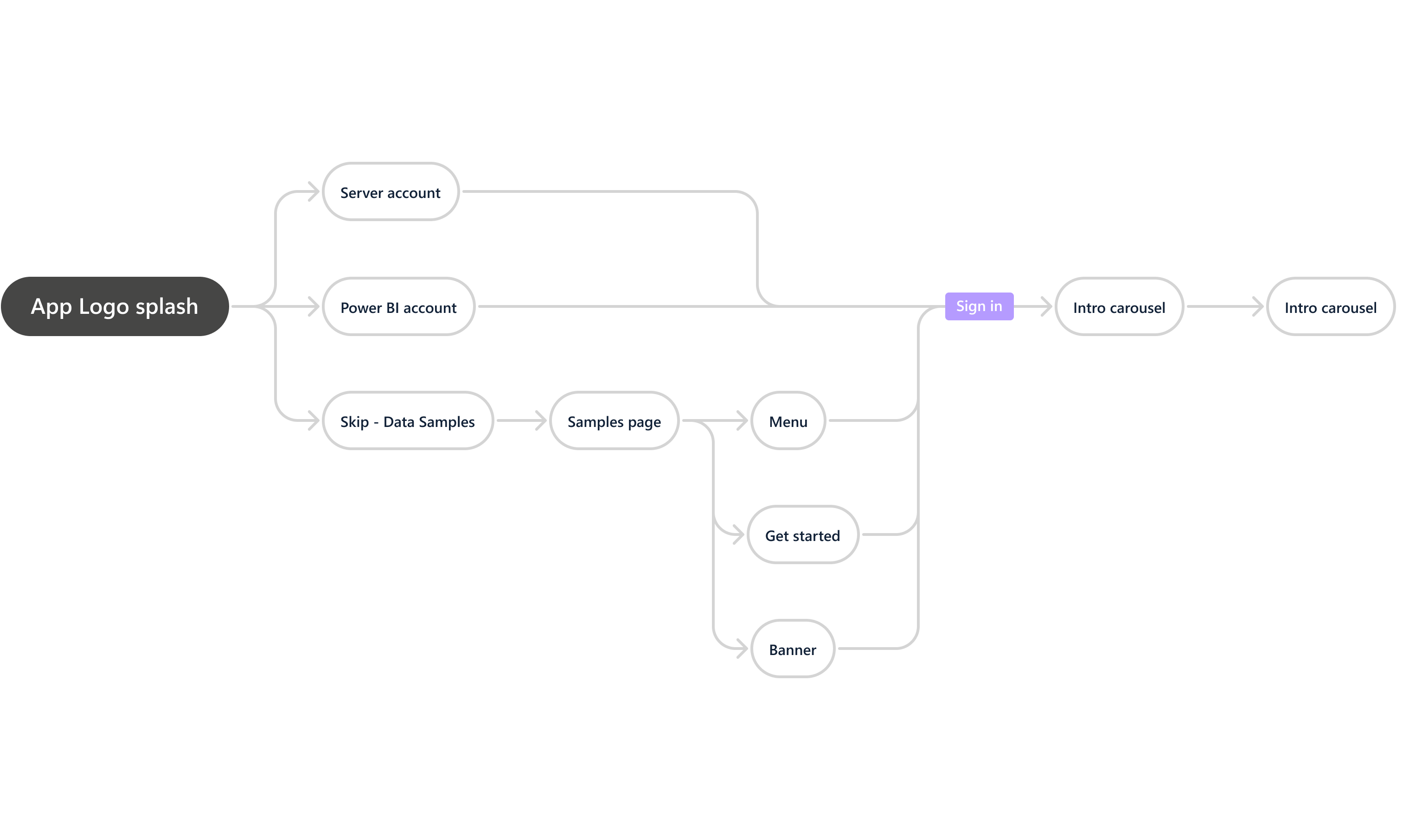
New Onboarding
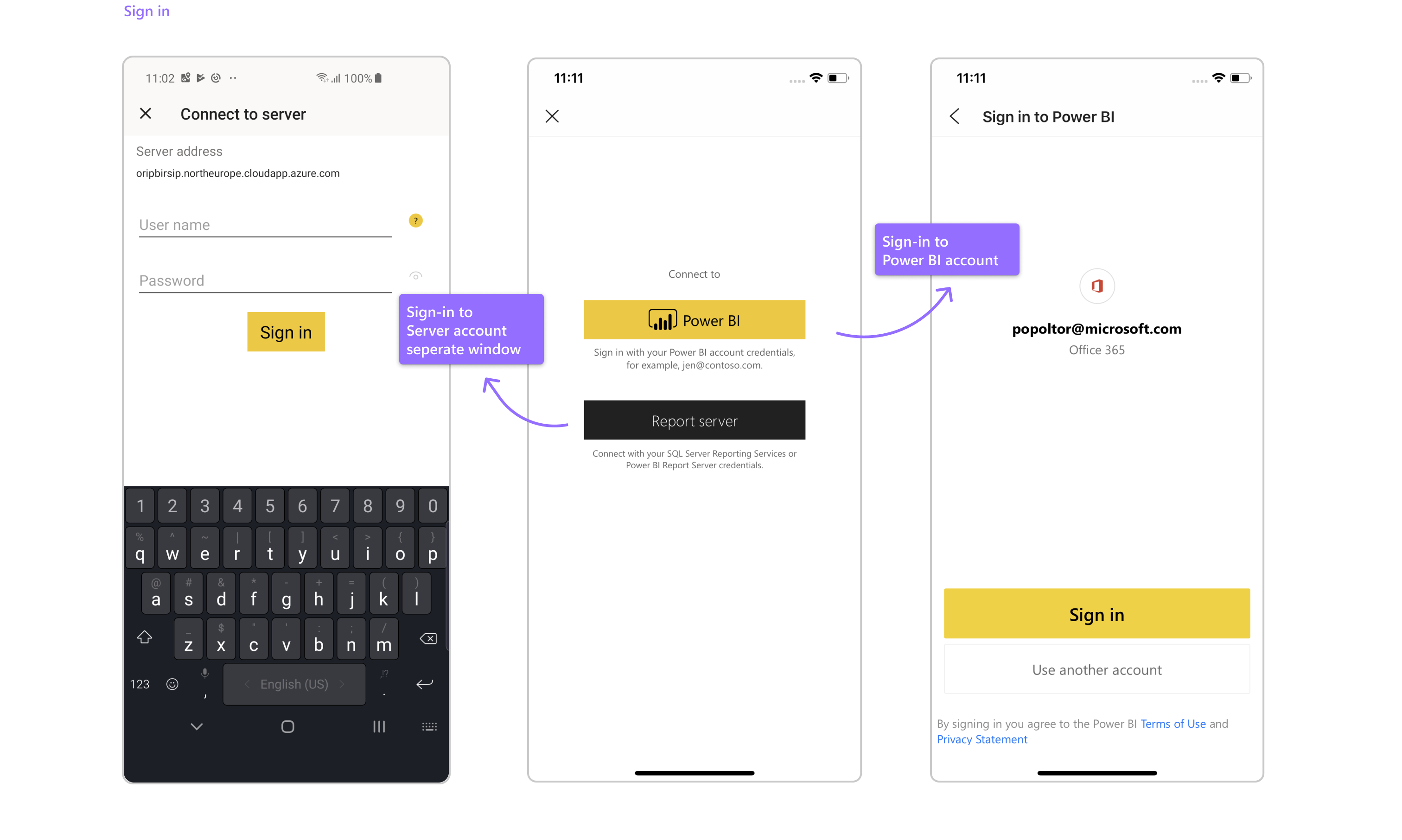
The idea was to create a one-page for both account sign-ins (Power BI & Server) - using a known tab pattern make it easy to navigate between the two sign-in screen without hiding it within inner pages.
The button to sign-in is now super clear and not confusing, while after signing- in we give the user a confirmation screen about his sign-in.
We worked together with a content designer and Illustrator to convey a clear and focused message to educate the user about the features and app capabilities on the go

Content discovery - think of Netflix for data ;)
The Samples page received a wider approach . If the user had no personal content - they'd see empty states all over the app. On home, recents, favorites, etc. They couldn't enjoy the app experience and learn more about how to consume data, explore it and navigate in it.
Today a few great things happening in Netflix -
• You can see your last interactions with content - Recents, Frequents, Favorites and you get what’s might be relevant for you
• Recommended strip based on X metrics/what others watched and you can explore more interesting content
• Aren’t we all spend X minutes trying to find something new and exciting to watch?
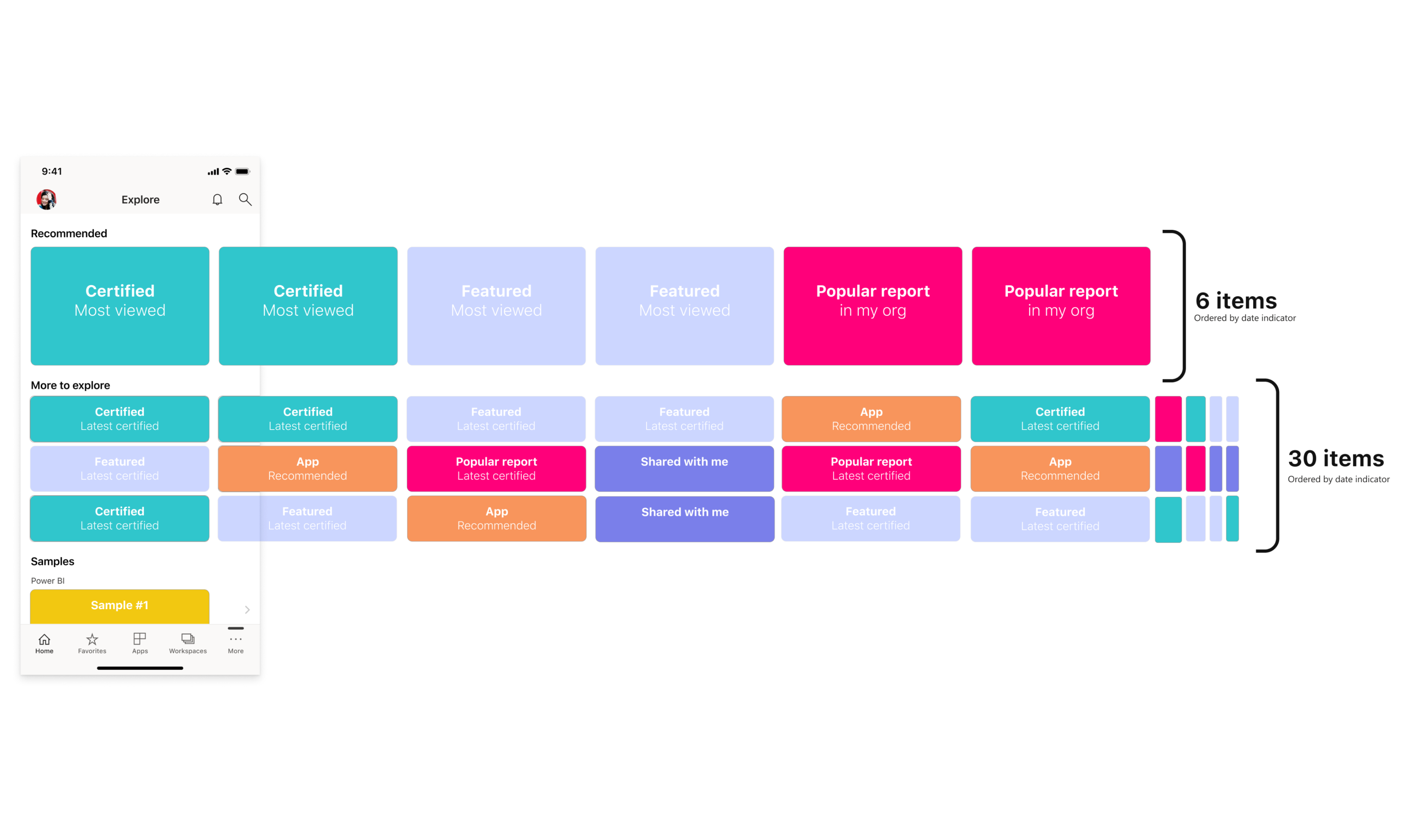
We presented Explore page, a new whole content discovery for FRE -
We decided to let them find what might be relevant to them - landing the users on a new 'Explore page' will bring the user a list of recommended items to discover & explore using a specific logic. The items in that new section can be reports, dashboards and apps. We will land those FRE users on Explore page instead of Home (a place for recent or frequents items). Users who are totally new to Power BI and have no viewing history - will enjoy exploring items from their organization or items that shared to them by others.
What's for current users? Those who will also enjoy that additional set of items by adding another strip to the Home page, which will help them discover new content (Today they have Recents, Frequents, and now 'Explore more' strip).
This will give the new users the opportunity to feel the app and learn more about it trough exploring on their own.
We worked together to decide on the logic and amount of items that the user will see when landing on Explore page, by the most popular and relevant items in their organization, that we think would be interesting for them to explore.
Today a few great things happening in Netflix -
• You can see your last interactions with content - Recents, Frequents, Favorites and you get what’s might be relevant for you
• Recommended strip based on X metrics/what others watched and you can explore more interesting content
• Aren’t we all spend X minutes trying to find something new and exciting to watch?
We presented Explore page, a new whole content discovery for FRE -
We decided to let them find what might be relevant to them - landing the users on a new 'Explore page' will bring the user a list of recommended items to discover & explore using a specific logic. The items in that new section can be reports, dashboards and apps. We will land those FRE users on Explore page instead of Home (a place for recent or frequents items). Users who are totally new to Power BI and have no viewing history - will enjoy exploring items from their organization or items that shared to them by others.
What's for current users? Those who will also enjoy that additional set of items by adding another strip to the Home page, which will help them discover new content (Today they have Recents, Frequents, and now 'Explore more' strip).
This will give the new users the opportunity to feel the app and learn more about it trough exploring on their own.
We worked together to decide on the logic and amount of items that the user will see when landing on Explore page, by the most popular and relevant items in their organization, that we think would be interesting for them to explore.
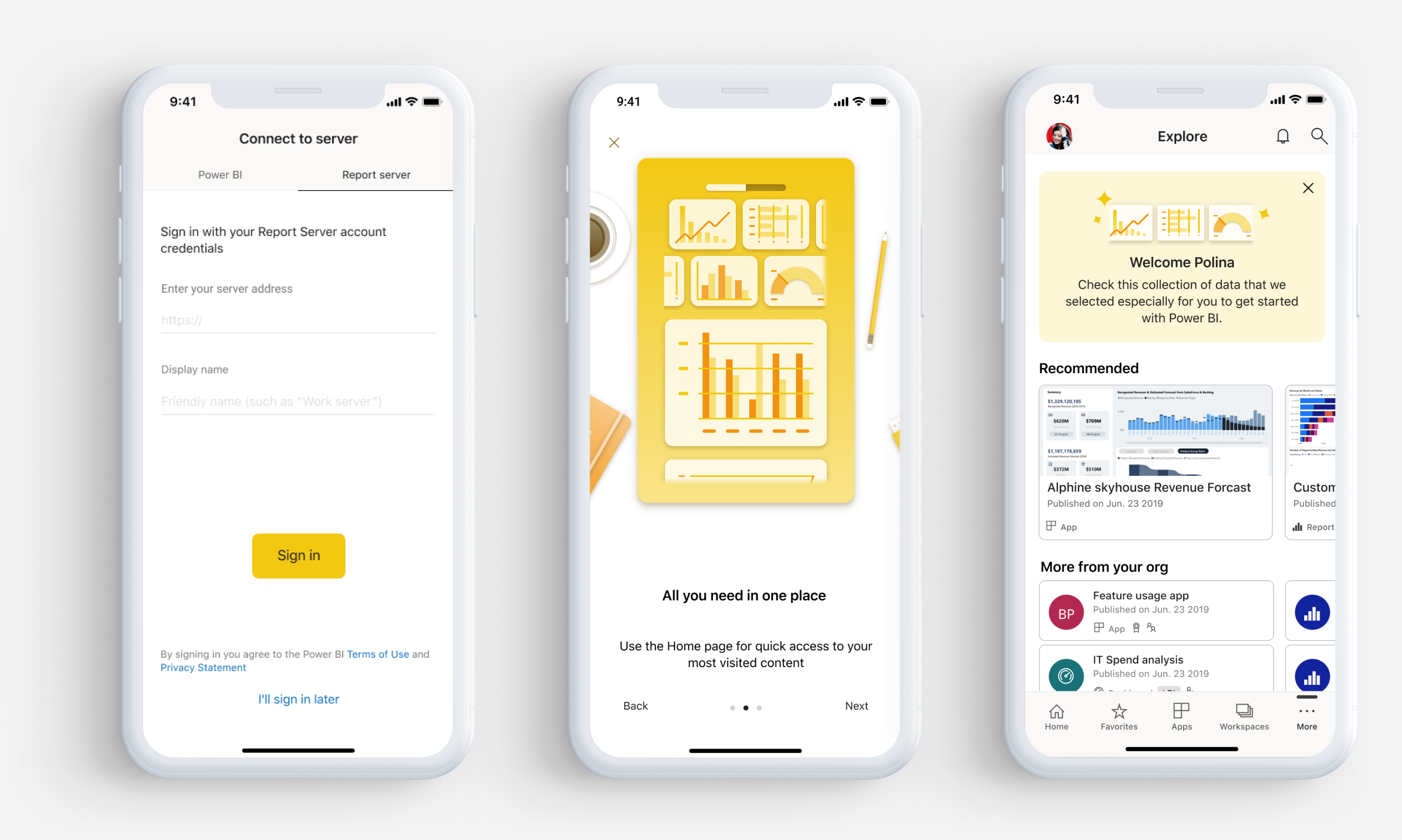
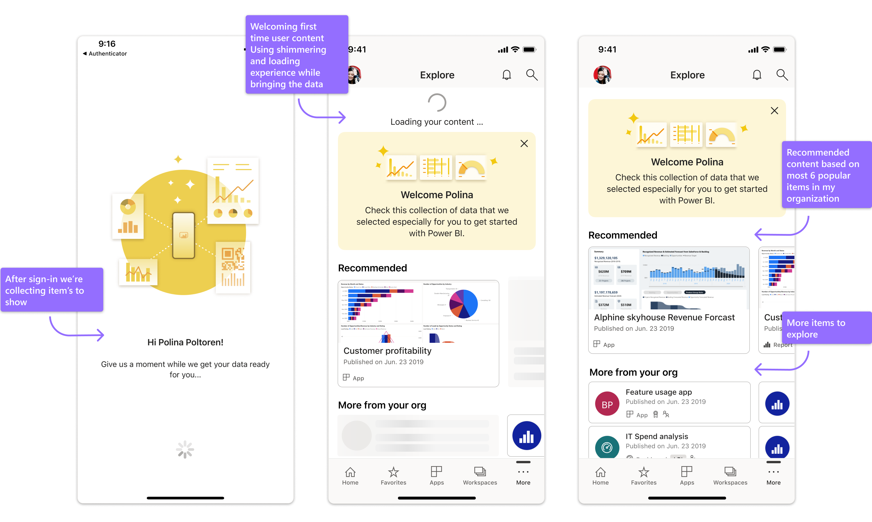
FRE new users after sign-in
When first time user signs-in to the App, and going through the previously showed onboarding experience, they land on 'Explore' page and not the Home page (which is currently empty as the FRE user don't have Recents or Frequents items, and there's only so much strips that we can show under the fold).
After signing - we welcoming the user, explaining them that this is a place we're we collected data that we thought would be relevant to them by using the previously showed logic. Sometimes it get's a few seconds to bring some of the items, therefor we use shimmering experience and content explanation.
When all page are loaded the shimmering and content disappears, the welcome message stays until they close it.
First we show the 6 most popular items in the org, with more info and screenshots visualization from the items, while they have more items under 'More to explore'.
The last strip are Samples - this is also a fallback for rare cases when we couldn't find even one item that shared with the user.
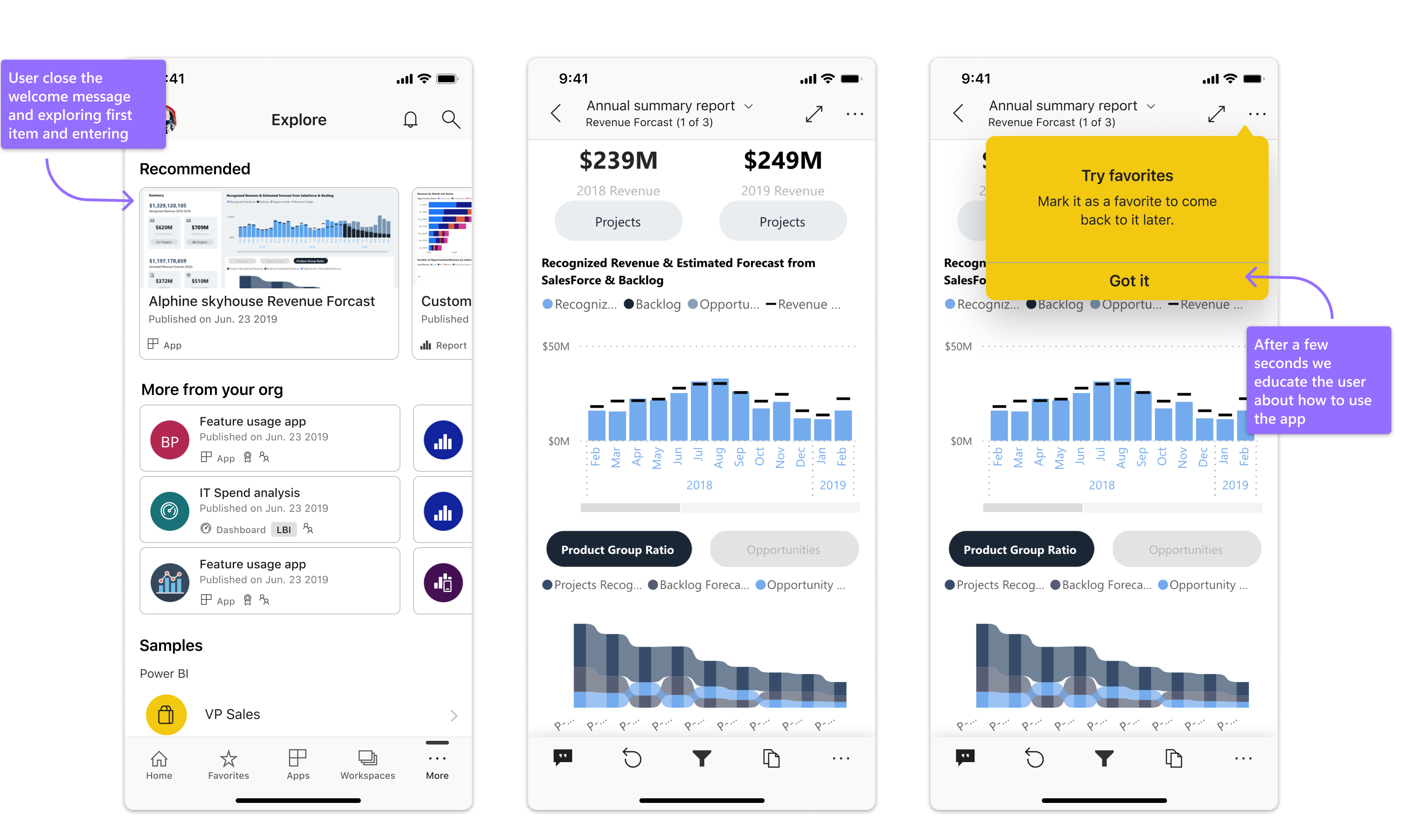
Prior the redesign our statistics showed that those who view an item during their first Power BI session are more likely to return to the app
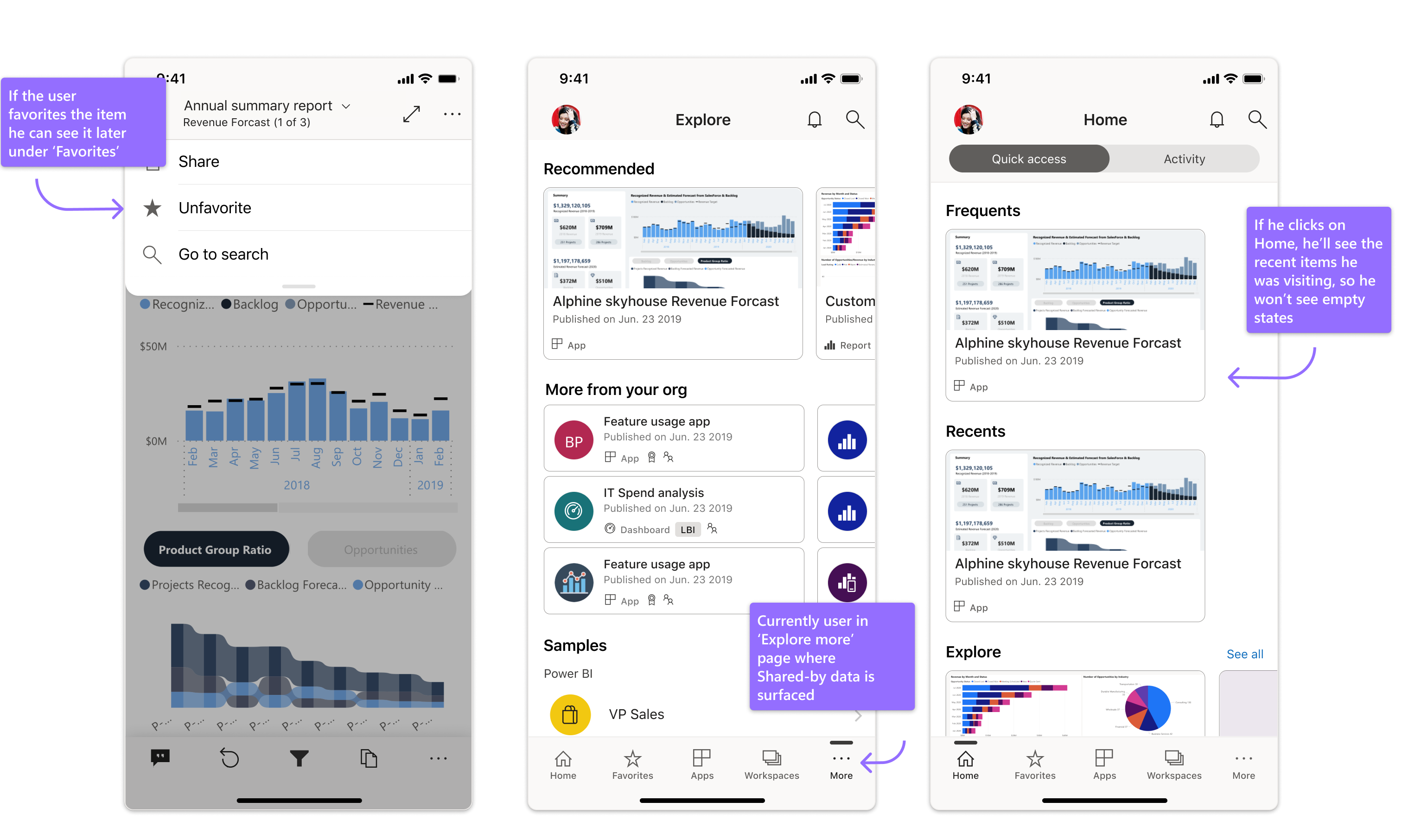
What with our current users? (Not FRE)
Those who already used content previously will also enjoy that additional set of items, which will help them discover new content.
Measuring success
• During the first month we saw that 22% of users landed on Explore page, what means that 22% supposed to land on Empty states and see zero content and we could lose many of them them
• Current users (Landing on home page) - 15% visited item directly from Home page
• Current users (Landing on home page) - 5% visited Explore page using 'see more'
• 10% users opened an item in 'Explore page' Recommended strip
• Current users (Landing on home page) - 15% visited item directly from Home page
• Current users (Landing on home page) - 5% visited Explore page using 'see more'
• 10% users opened an item in 'Explore page' Recommended strip
What with our current users? (Not FRE)
Those who already used content previously will also enjoy that additional set of items, which will help them discover new content.